
Mastering Lead Generation Best Practices: Strategies for 2026 Success
Master lead generation best practices for 2026 success. Discover strategies, AI tactics, and content approaches to drive qualified leads.

Nitin Mahajan
—
November 22, 2025


If you want to reduce cart abandonment, you have to start by playing detective. You can't just throw solutions at the wall and see what sticks; you need to figure out why shoppers are leaving in the first place.
The most common culprits? Unexpected costs, a checkout process that feels like a marathon, and forcing people to create an account. Tackling these head-on is almost always the quickest way to win back those lost sales.
Before you can solve the puzzle of abandoned carts, you need to gather the right clues. Guesswork won’t cut it. The real answers are buried in your website's data, showing you exactly where customers are dropping off.
This initial analysis is a critical part of building an effective marketing strategy for ecommerce that actually grows your business. Using a tool like Google Analytics, you can follow the user journey from the product page through checkout. Are they bailing when the shipping calculator appears? Or is it when they’re asked to create yet another password? Every click—or lack thereof—tells a story.
The reasons for abandonment almost always fall into a few key buckets. We can get a clear picture by looking at the hard data.
This table breaks down the most common friction points that cause shoppers to leave without buying. It's a great starting point for prioritizing what you need to fix first.
These numbers tell a powerful story: hidden costs and unnecessary friction are your biggest enemies. By focusing on transparency and simplicity, you can solve the majority of these issues.

As you can see, the data is pretty clear. Financial surprises and clunky checkout experiences are the biggest conversion killers. Your first job is to tackle those.
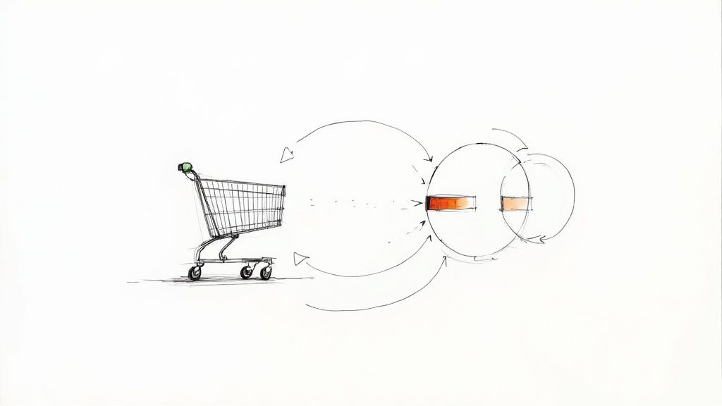
Let's be honest: a clunky, confusing checkout is one of the fastest ways to lose a sale. Your goal isn't just to have a "buy now" button; it's to make the entire process so smooth that customers glide from adding an item to their cart to seeing that "Thank You" page without a second thought.

Think of your checkout as the express lane at the grocery store. It needs to be clean, direct, and completely free of distractions. This means stripping out any unnecessary navigation, pop-ups, or sidebars that could pull the customer's attention away from the one thing that matters: completing their purchase.
The numbers don't lie. Research from ClickPost.ai shows that over 22% of shoppers will bail if the process is too long or complicated. Even worse, forcing someone to create an account before they can buy drives away a staggering 24% of potential customers.
Making the checkout process feel natural and intuitive is the name of the game. You can make a massive difference with just a few practical tweaks.
Every field you eliminate and every step you simplify is a direct investment in your bottom line. You're removing the mental roadblocks that cause people to hesitate and ultimately abandon their carts.
These kinds of adjustments are central to any effective conversion rate optimization strategy. They go right to the heart of the friction points that cost you sales every single day.
There’s no quicker way to kill a sale than springing surprise fees on a customer at the very last second. Think about it from their perspective: they’ve found something they love, they've committed to buying it, and then bam—the price jumps at checkout with unexpected shipping and taxes. It feels like a bait-and-switch, and it's a huge reason people leave.
The solution is simple, yet so many stores get it wrong: be transparent about the total cost, right from the start.
This isn't a minor issue; it's a massive deal. Nearly 48% of shoppers will ditch their cart because the extra costs are too high. That means you could be losing almost half your potential sales just because of a pricing surprise. You can dive deeper into these kinds of numbers with the latest cart abandonment stats on Analyzify.com.
Don't wait until the final payment screen to reveal shipping costs. The best place to show this is right on the cart page itself. A simple shipping calculator that lets customers enter their zip code for an estimate is a fantastic tool. It gives them the full picture before they invest time filling out their personal details.
Another powerful tactic is offering a free shipping threshold. This doesn't just eliminate the negative surprise of shipping fees; it can actually bump up your average order value.
A clear banner at the top of your site shouting "Free shipping on orders over $50!" works wonders. It manages expectations immediately and nudges shoppers to add just one more item to their cart to qualify.
When you offer multiple shipping options, clarity is everything. Ditch the confusing industry jargon and lay out the choices in plain English.
Here are a couple of popular, customer-friendly approaches:
Even with a perfectly tuned checkout process, some shoppers are bound to get sidetracked. Life happens. But a lost cart doesn't have to mean a lost sale. A solid recovery strategy is your last, and often most powerful, line of defense to bring those customers back.
This is where automated abandoned cart messages become your secret weapon. When done right, these are highly effective nudges that guide interested buyers right back to your store. The trick is to be timely, personal, and genuinely helpful.
A well-timed email or SMS can honestly make all the difference. The numbers don't lie: cart abandonment emails boast an impressive average open rate of 39.07%. This is one of the highest-performing email types you can send.
Campaigns that use a sequence of three emails consistently bring in more revenue than just sending a single message. You can dig deeper into these powerful email marketing stats on EmailVendorSelection.com.
Timing is everything, so here’s a sequence that works wonders:
Your goal isn't to pressure them into buying. It's to remind them of the value they saw in your product in the first place. A simple subject line like "Did you forget something?" or "Your items are waiting for you" feels friendly and gets the job done.
Beyond email, don't forget about other channels. Understanding how retargeting ads work can help you keep your products top-of-mind as shoppers browse other sites. To really scale this, you'll want to explore the different features of cart recovery platforms that automate and personalize these campaigns across multiple channels for you.
Let's face it: online shoppers are more skeptical than ever. They're constantly on the lookout for red flags, and if your checkout process feels even a little bit shady, they'll be gone in a flash. Building a secure shopping environment isn't just a nice-to-have feature; it's the bedrock of a successful checkout.
This all starts with the basics. An SSL certificate—the little padlock you see in the browser's address bar—is absolutely non-negotiable. Beyond that, strategically placing trust badges from names like McAfee or Norton can instantly calm a nervous shopper's fears, assuring them that their personal information is safe with you.
You have to show customers they can trust you. Don't make them hunt for reasons to feel secure; put them front and center.
A customer who feels confident in your store's security is far less likely to get cold feet at the final step. Think of every trust signal as another reason for them not to abandon their cart.
To build that unshakeable trust, it's vital to ensure that all payment processes are not only secure but also straightforward for customers, especially for secure and easy international money transfers.
Let's face it: a clunky mobile experience is one of the fastest ways to kill a sale. With over 60% of e-commerce traffic now coming from smartphones, you can't afford a site that's a pain to use on a small screen.
If your customers are pinching and zooming just to read a product description or trying to hit a tiny button with their thumb, you’re basically telling them to go shop somewhere else. This isn’t a nice-to-have anymore; it’s the bare minimum.
The standard today is a fully responsive design—one that fluidly adapts to any screen size, whether it's a phone, a tablet, or a big desktop monitor. This makes sure every part of your store, from the product photos to that all-important "Add to Cart" button, is easy to see and even easier to tap.
Beyond just looking good on a phone, your site has to be fast. Seriously fast. Even a one-second delay in page load time can send your conversion rates off a cliff.
A slow website feels broken and untrustworthy. It gives shoppers the impression that you don't care about their experience, and that's a terrible first impression to make. Think of speed as a core part of building trust.
Luckily, you don't need to be a developer to make some big improvements. Here are a few things you can do right away:
Even with a great plan, a few questions always pop up when you start digging into cart abandonment. Let's cover some of the most common ones I hear from store owners.
Everyone wants to know the magic number, but the truth is, it depends. The industry average hovers around 70%, but a "good" rate for a furniture store selling $3,000 sofas is going to be wildly different from a shop selling $15 phone cases.
Instead of comparing yourself to a vague average, focus on your number. If you’re at 75% today, your goal should be to get that down to 70%. That’s a massive win. Your real benchmark is your own baseline.
Think of your checkout as a living, breathing part of your store—not something you set up once and forget. I always tell clients to plan on running at least one A/B test every quarter.
It could be something as small as changing your button copy from "Continue" to "Continue to Payment," or testing a different layout for your shipping options. The key is to test just one thing at a time. That’s the only way you’ll know for sure what actually made a difference.
The stores that win are the ones that never stop tinkering. A small lift here and a small improvement there add up to a huge amount of recovered revenue over a year.
It’s all about consistent, small optimizations. For example, a lot of people assume throwing a discount into an abandoned cart email is the best move. But sometimes, that just trains your customers to wait for a coupon. Test a simple reminder against an incentive and see what your audience actually responds to.
At BrandBooster.ai, we use data to find the exact friction points in your checkout and build a plan to get that lost revenue back. We deliver real returns on your marketing spend in 60 days, or you don't pay. Learn more about how we can help your e-commerce store.